Many teams begin grafana network monitoring after experiencing a painful outage that should have been obvious earlier. The routers were reachable. Ping checks were green. The app still felt slow, users complained, and nobody could answer a basic question fast enough: was the bottleneck the network, the host, or the service path between them?
That gap is where basic monitoring fails. It tells you whether something responds. It does not tell you whether an interface is saturating, whether errors are rising on a switch uplink, whether a firewall is dropping traffic under load, or whether an alarm pattern has been building for hours.
Grafana is useful here because it is not just a dashboard tool. Used properly, it becomes the operational surface for your metrics, logs, status history, and alerts. That matters when you need one place to inspect bandwidth trends, correlate alarms, and decide whether to page a network engineer or leave the issue with the application team.
Moving Beyond Basic Network Pings
A ping check is a poor proxy for network health.
It answers one narrow question: can one endpoint reach another right now. It does not answer whether the path is congested, whether an interface is dropping packets, or whether device performance is degrading under normal business traffic.
What basic checks miss
A network can look healthy from an uptime dashboard and still be failing users in practice.
Common blind spots include:
- Bandwidth saturation: Links stay up while utilization climbs high enough to slow application traffic.
- Intermittent faults: Short bursts of loss or interface errors often disappear between manual checks.
- Device pressure: Firewalls, routers, and switches can stay reachable while internal resource strain affects forwarding behavior.
- Context loss: A single red or green state gives no clue whether the issue is isolated or part of a wider pattern.
If your current stack is mostly ICMP checks, pair that with deeper path validation using tools like blackbox exporter with Prometheus. Reachability still matters. It just cannot be the whole monitoring strategy.
Why blind collection is expensive
A lot of teams overcorrect. They move from almost no telemetry to collecting everything exposed by every MIB they can find.
That is how observability bills get ugly. Real-world data indicates that 35% of teams overspend by double on network telemetry due to unfiltered MIB imports via snmp_exporter, a problem called out in Grafana’s discussion of reducing telemetry waste in Grafana Cloud observability rings.
The lesson is plain. Better visibility does not come from more metrics. It comes from the right metrics, labeled well, retained sensibly, and surfaced in dashboards that support action.
Tip: Start with interface traffic, errors, discards, device health, and alarm state. Add deeper SNMP trees only when an operator has a real use case for them.
The operational shift that matters
Good grafana network monitoring changes the question your team asks during incidents.
Instead of asking, “Is it up?” ask:
- How is it performing right now
- What changed
- Which device, interface, or segment is responsible
- Is the issue isolated or systemic
That is the difference between reactive monitoring and operational control.
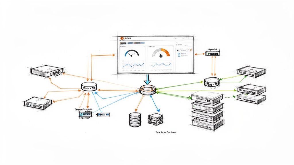
Designing Your Monitoring Architecture
A production stack needs a clean data path. If you blur collection, storage, and visualization together, troubleshooting gets messy fast.

The baseline architecture
At a minimum, the stack has four layers:
| Layer | Role | Typical tools |
|---|---|---|
| Device layer | Exposes counters and state | Routers, switches, firewalls, wireless gear |
| Collection layer | Polls or receives telemetry | snmp_exporter, Telegraf, OpenNMS |
| Storage layer | Scrapes and stores time series | Prometheus, InfluxDB |
| Visualization and alerting | Queries data and presents it | Grafana |
This split is worth keeping even in smaller environments. When data disappears, you can ask a precise question at each hop. Did the device expose it? Did the collector fetch it? Did the TSDB store it? Did Grafana query it correctly?
Why Grafana sits at the top
Grafana, launched in 2014, became a cornerstone for network monitoring by integrating with time-series databases to visualize metrics from SNMP, which allows scraping interface traffic from routers and switches. This is foundational for tracking bandwidth and preventing outages in enterprise networks, as described in Grafana’s guide to network monitoring with Grafana and Prometheus.
That architecture matters because Grafana should not be your collector of record. It should be the place where operators consume data, compare states over time, and respond.
A practical data flow
The cleanest mental model is this:
Network devices expose telemetry
Routers and switches expose counters such as interface octets, errors, and status through SNMP. Some environments add JMX or Prometheus-native metrics where available.Collectors normalize access
An exporter or agent translates device data into a shape your storage system can scrape or ingest.The TSDB becomes the source of truth
Prometheus or InfluxDB stores time-stamped samples. Here, retention, scrape interval, and cardinality decisions are critical.Grafana queries, correlates, and alerts
Operators get traffic graphs, alarm summaries, state history, and dashboards that can pivot by device, interface, site, or service.
What to centralize and what not to
Do centralize:
- Metric storage
- Alert rules
- Dashboard provisioning
- Label conventions
Do not centralize too aggressively at the collection edge if it creates a single brittle polling point for everything. Distributed collection often scales better, especially when sites or business units are separated operationally.
Key takeaway: The architecture should make failure obvious. If an interface graph goes blank, you should be able to isolate the fault path in minutes, not argue about which tool owns the problem.
The architecture mistake I see most often
Teams often treat Grafana as the project and the data pipeline as an afterthought.
That leads to pretty dashboards backed by inconsistent labels, noisy polling, uneven retention, and collectors that nobody can reason about under pressure. Build the pipeline first. Grafana becomes far more valuable once the plumbing is predictable.
Choosing Your Data Collection Stack
The most important design choice is not the dashboard layout. It is the path your network data takes from device to storage.

If you get the collection stack wrong, every downstream task becomes harder. Querying is slower, alerting is noisier, and scaling gets expensive earlier than it should.
Prometheus versus InfluxDB
For grafana network monitoring, both can work. They are not interchangeable in practice.
Prometheus works best when
Prometheus is usually the better fit when your team already uses Kubernetes, exporters, and PromQL. It shines when you want:
- Pull-based collection: Scrape targets on a schedule and keep collection logic simple.
- Strong ecosystem support: snmp_exporter, node_exporter, and a large set of integration patterns.
- Operational consistency: One language and model across infra, app, and network metrics.
The downside is that Prometheus punishes careless cardinality and can become expensive to run if you scrape too much too often.
InfluxDB works best when
InfluxDB makes sense when you prefer agent-driven writes, already use Telegraf heavily, or want a pipeline that is more flexible around inputs and outputs.
It is often easier to fit into mixed environments where some data comes from SNMP, some from custom agents, and some from edge systems that are better at pushing than being scraped.
The trade-off is ecosystem gravity. In many DevOps teams, Prometheus remains the default language of operations, and that matters when you need broad team adoption.
My default recommendation
For most engineering-led teams, use Prometheus plus Grafana for core network observability unless you already have a mature InfluxDB practice.
If you want a second opinion on that architecture in a broader observability rollout, this write-up on Prometheus network monitoring is a useful companion.
snmp_exporter versus Telegraf
This is the decision that shapes your collection behavior.
| Option | Best for | Strengths | Trade-offs |
|---|---|---|---|
| snmp_exporter | Prometheus-first teams | Native fit with scrape model, clean exporter pattern | MIB selection can get noisy fast |
| Telegraf | Mixed telemetry environments | Flexible inputs and outputs, broad plugin support | More moving parts if you only need simple SNMP polling |
Choose snmp_exporter when simplicity wins
If the stack is Prometheus-centric, start with snmp_exporter.
It is a good fit when you want one consistent pattern for collectors and when your operators are already comfortable reading target labels, scrape jobs, and PromQL. The key is to keep the generated snmp.yml lean. Do not import every possible OID tree just because the vendor exposes it.
That is the classic trap. Polling everything feels safe at first and becomes expensive later.
Choose Telegraf when flexibility wins
Telegraf is stronger when your collection needs are broader than SNMP alone.
It can gather network telemetry and feed multiple destinations. In more complex environments, that flexibility is useful. It also fits well when your network metrics need to live beside host, service, or custom application telemetry from the same agent layer.
A documented enterprise pattern uses Telegraf agents collecting gNMI and SNMP at 10-second sampling intervals, feeding a Prometheus server, and achieving 99.8% data accuracy with sub-second query response times. The same study notes the cost side of that choice: 10-second intervals increase Data Points Per Minute to 6, while 60-second intervals produce 1 DPM and are the recommended baseline for most metrics in production-sensitive setups, according to the IJERA paper on Grafana network monitoring architecture.
That single design choice is where teams either preserve efficiency or burn resources.
Sampling interval is a business decision
Many teams treat scrape or poll intervals as a technical default. It is not. It is a cost and fidelity decision.
Use shorter intervals for:
- High-value links
- Critical firewalls
- Short-lived traffic spikes you must catch
- Troubleshooting windows
Use a baseline interval for:
- General device health
- Routine interface visibility
- Long-term capacity trending
Tip: If an operator cannot explain why a metric needs high-frequency sampling, it probably does not.
A sane collection pattern
A practical production setup usually looks like this:
Start with a narrow metric set
Interface traffic, operational status, errors, discards, CPU, memory, and key environmental or chassis health where available.Separate profiles by device type
Access switches, core routers, firewalls, and wireless controllers should not all share the same collection footprint.Use labels that survive growth
Device name, role, site, environment, and interface labels should be predictable from day one.Keep secrets and credentials centralized
Polling should be easy to rotate and audit.Version-control collector config
Ifsnmp.yml, Telegraf inputs, and Prometheus jobs live outside version control, drift will become your hidden outage source.
A useful walkthrough can help your team visualize the moving parts before you lock the design:
What works and what does not
What works:
- Prometheus with disciplined exporter configs
- Telegraf when you need protocol flexibility
- Per-device-class polling profiles
- Defaulting most metrics to lower-frequency collection
What does not:
- Blindly importing vendor MIB trees
- Using one scrape interval for every metric
- Treating labels as an afterthought
- Letting each engineer hand-tune collectors outside code review
The data collection stack is where grafana network monitoring either stays maintainable or becomes a permanent cleanup project.
Building Actionable Network Dashboards
A dashboard is only useful if it helps someone decide what to do next.
That sounds obvious, but many Grafana setups are still full of panels nobody uses during incidents. They look polished and answer nothing urgent. Good network dashboards are narrower, faster to read, and built around operator decisions.

Start with operator questions
Build each panel around one question:
- Is this interface saturated
- Are errors or discards rising
- Which device is the outlier
- Did state change recently
- Is the problem local to one site or across a class of devices
If a panel does not support one of those decisions, cut it.
The panels worth building first
Interface traffic time series
This is the core graph. Plot inbound and outbound bandwidth on the same panel, grouped by interface or filtered by a template variable.
For host-based traffic metrics, a pattern like the following works well:
rate(node_network_receive_bytes_total{device!~"lo|docker.*|veth.*",instance="$instance"}[5m]) * 8rate(node_network_transmit_bytes_total{device!~"lo|docker.*|veth.*",instance="$instance"}[5m]) * 8
If you use SNMP-derived interface counters instead, the same principle applies. Use rate() on cumulative counters, convert bytes to bits where needed, and keep the legend readable.
Utilization gauges
A gauge is useful when it answers a current-state question fast.
Use it for a single selected uplink or WAN interface. Do not fill a page with gauges. One or two can help during triage. Twenty turns the dashboard into decoration.
Error and discard panels
These matter more than teams expect.
Traffic growth may be healthy. Error growth rarely is. Put interface errors and discards near bandwidth charts so engineers can see both throughput and quality in one scan.
Top talkers
Fleet-wide dashboards need a ranking view.
A top-k panel is often better than another wall of line charts because it surfaces the hosts or devices consuming unusual bandwidth right now.
Make dashboards reusable
The fastest way to create dashboard sprawl is cloning one dashboard per device.
Use template variables instead. At minimum, support:
| Variable | Purpose |
|---|---|
instance |
Switch between devices or exporters |
device |
Narrow to a specific interface or logical device |
site |
Slice by location or environment |
That structure keeps one dashboard useful across many devices without duplicating panels.
Provision, do not hand-edit forever
Dashboards should live in version control and be provisioned like code.
That gives you:
- Change history
- Review before rollout
- Repeatable environments
- Safer edits during incidents
If your team needs help designing maintainable dashboard standards rather than a pile of one-off views, OpsMoon’s Grafana services are aligned with that kind of implementation work.
Key takeaway: Dashboards are part of the operating model, not presentation. Build them for responders first, executives second.
A reusable panel snippet
Here is a compact JSON panel model you can adapt for a bandwidth panel built around host network metrics:
{
  "title": "Interface Bandwidth",
  "type": "timeseries",
  "targets": [
    {
      "expr": "rate(node_network_receive_bytes_total{device!~\"lo|docker.*|veth.*\",instance=\"$instance\"}[5m]) * 8",
      "legendFormat": "Inbound {{device}}"
    },
    {
      "expr": "rate(node_network_transmit_bytes_total{device!~\"lo|docker.*|veth.*\",instance=\"$instance\"}[5m]) * 8",
      "legendFormat": "Outbound {{device}}"
    }
  ],
  "fieldConfig": {
    "defaults": {
      "unit": "bps"
    }
  },
  "options": {
    "legend": {
      "displayMode": "table",
      "placement": "bottom"
    }
  }
}
The important part is not the JSON itself. It is the discipline behind it. Keep units explicit, legends clean, and variables consistent across every panel.
Implementing A Proactive Alerting Pipeline
Dashboards help engineers investigate. Alerts decide when engineers must stop what they are doing.
That distinction matters because a noisy alerting system trains people to ignore real signals. In network monitoring, the worst alert is not the one that fires. It is the one that fires so often nobody trusts it anymore.

Alert on symptoms with context
A threshold alone is usually weak.
“Interface above X” can be useful, but it becomes much better when paired with context such as sustained duration, rising errors, or known device role. Alerting should reflect operational impact, not just metric existence.
Good network alerts often combine:
- A sustained condition: not a brief spike
- A device or interface label: so routing is obvious
- A service or site tag: so responders know scope
- A link to a dashboard: so triage starts immediately
Rules that operators trust
A solid rule tends to have three properties.
First, it waits long enough to avoid flapping. Second, it includes labels and annotations that explain what failed. Third, it routes to the right place without forcing a human relay.
Examples of alert intent that work well:
Critical uplink degradation
Fire when utilization stays high and error rate is rising on a primary link.Interface state instability
Fire when a port changes state repeatedly over a meaningful interval.Device health under pressure
Fire when device resource strain coincides with traffic impact indicators.
Group related notifications
A real network incident often creates a cluster of signals. One upstream fault can produce device alerts, path alerts, and service alerts within minutes.
If you do not group notifications, the on-call engineer gets buried. Group by site, role, or upstream dependency so one event does not explode into a paging storm.
Tip: Grouping is not only for comfort. It preserves signal quality during incidents by helping responders see one problem as one problem.
Delivery channels matter less than payload quality
Slack, email, and PagerDuty all work if the alert itself is useful.
The notification should include:
- What failed
- Where it failed
- How long it has been failing
- Which dashboard or runbook to open next
The faster your alert gives that context, the less time your team wastes reconstructing basics during an incident.
The best proactive pipeline is the one your team believes. That usually means fewer rules, stronger conditions, and better routing.
Scaling, Optimizing, and Troubleshooting Your Setup
A grafana network monitoring stack that works for a few devices can fail badly once you expand scope. The problems usually do not begin in Grafana itself. They begin in metric shape, query behavior, and collection discipline.
High cardinality is the hidden tax
The most common scale issue is high-cardinality metrics.
Each extra label combination increases the number of time series your storage and queries must handle. In network monitoring, this grows quickly when teams ingest every interface detail, every port-level dimension, and every vendor-specific metric without filtering.
Grafana documents a practical guardrail here. Prometheus data sources in Grafana can be configured to limit expensive queries to the last 5 minutes to avoid performance issues, which is one of the operational tactics described in Grafana’s metrics usage analysis guidance.
That setting will not save a bad metric strategy, but it can stop exploratory queries from hurting the system.
What efficient ingestion looks like
Efficiency is not just about query settings. It starts at collection.
Grafana’s documentation also shows how modest telemetry patterns can stay efficient. In one LoRaWAN example, a 20-sensor fleet transmitting every 10 minutes uses 2,880 of the 86,400 daily requests available in a free tier, which is a useful reminder that telemetry volume should be matched to operational need, not maximal collection.
The lesson for network stacks is straightforward. Polling and ingest should be intentional.
Practical ways to control scale
Use these levers first:
- Filter aggressively at the edge: Keep only the metrics you chart, alert on, or review in postmortems.
- Split dashboards by purpose: An executive status board and an engineer troubleshooting board should not run the same query load.
- Reduce label sprawl: Standardize device, role, site, and environment labels. Remove labels that add uniqueness without helping operations.
- Tune time ranges: Default dashboards to short operational windows. Let users expand only when investigating history.
A troubleshooting checklist that works
When data is missing or a query is slow, move through the path in order.
If a panel is blank
Check:
Collector health
Is the exporter or agent still polling the target?Target status in the TSDB
Did Prometheus scrape it successfully, or did the target drop out?Metric naming and labels
Did a config change rename a label or alter cardinality in a way that broke panel queries?Time range and variable values
A surprising number of “outages” stem from bad dashboard variable selections.
If queries are dragging
Look at:
- Wide regex filters
- Long time windows
- Top-k or aggregate queries over too many labels
- Panels loading too many series at once
What works at larger scale
The stable pattern is boring, and that is a good sign.
Use narrower metric sets, stricter dashboard standards, controlled label vocabularies, and separate high-frequency collection from baseline collection. Avoid letting every team expose metrics in its own style.
Key takeaway: You do not scale grafana network monitoring by adding hardware first. You scale it by reducing waste in collection, labels, and queries.
From Data Visibility to Operational Control
The key benefit is not just that Grafana shows network data. The win is that your team starts making better operational decisions with less guesswork.
A strong stack gives engineers one place to inspect traffic, errors, device state, and alert history. Over time, that changes incident response, capacity planning, and accountability. Problems get discussed with evidence instead of intuition.
If you want help turning grafana network monitoring into a production-grade operating system for your infrastructure, OpsMoon can help with architecture planning, implementation, and ongoing DevOps support. Their team starts with a free work planning session, maps the right observability approach for your environment, and matches you with experienced engineers who can build and tune the stack without turning it into another internal maintenance burden.
Leave a Reply